Sunday, December 7, 2014

A Living Collection

Title: Owl Butterfly
Year: 2014
Material: Large, colorful wings, long legs and antennae, compound eyes.
Creator: Nature
Collection: The Academy of Natural Sciences of Drexel University


More Info
As a young girl, I was enamored with butterflies. I chased them around the neighborhood, used every color in my crayon box to create my own butterfly illustrations, and could recite Eric Carle’s The Very Hungry Caterpillar by heart. These tiny creatures were like real-life fairies. Not only was I mesmerized by their beauty, I was also drawn to their transformative nature. While I often felt more like an awkward, fuzzy little caterpillar, I held onto the hope that I too could develop my own sort of colorful wings. This week, as I entered the Butterflies! Exhibit at The Academy of Natural Sciences of Drexel University, these childhood memories came fluttering back.

On any given day, Butterflies! exhibits a living collection of 60 to 150 butterflies that represent 20 to 40 unique species. The museum receives new butterflies each week, from rainforests and secondary forests across the world. Butterflies live for one to two weeks, so the collection is in constant flux. 

Do I spy a butterfly or a snake?!
Compared to the flashy oranges, blues, reds and bold patterns of some other species, the Owl Butterfly is a bit of a Plain Jane. However, its earthy brown, black, and yellow coloration and muted markings serve a vital purpose: protection. See that that round, marking on its wing that looks like an eye? That’s called an eyespot. In its natural habitat (rainforests of Mexico, Central and South America), this eyespot might cause an owl butterfly to be mistaken for a much larger creature. For instance, a lizard (a known predator) in search of a meal might see the eyespot and think it is looking at the head of a snake, and quickly retreat. Phew! The Owl Butterfly lives another day!

Eyes? Nope, just colorations on the back of an owl's head.
The butterfly’s eyespot is a form of automimicry, where one part of a body looks like, or visually mimics another part. Not only can automimicry protect creatures from predators, these visual imitations may also serve to attract or communicate with mates. Many other creatures use camouflage or automimcry. See that owl photo? That’s actually the back of the owl’s head.

If you’ve ever been to a zoo or a botanical garden, you probably know that living collections are “displayed” differently than inanimate objects. They are often placed within a context or defined space, but their behavior and positioning within that space is constantly changing. Butterflies can be found flapping their wings around the room, feasting on bananas at feeding stations, perched on plants, and resting on walls and the floor (watch your step!).

Descriptive text and signage is used sparingly within the Butterflies! exhibit, and primarily serves to
Example of exhibit text
encourage visitors to carefully explore their surroundings. Notice here how this example poses questions and uses playful language. During my visit, I was also approached by a staff person, who provided additional interpretation by pointing out different butterfly species throughout the space, as well as other creatures, including a poisonous dart frog (don’t worry, it was enclosed in an aquarium).

Corridor outside of Butterflies!
Additional objects beyond the environmentally controlled walls of this living collection help visitors to deepen their understanding and appreciation for butterflies.  A corridor outside of exhibit displays photographs, diagrams and detailed text. Here, visitors can learn what and how butterflies eat, where they live, how they migrate, and other fun facts. Not all of the information is light, however. Reading on, they can read about how butterflies play an important role as pollinators, the serious threats butterfly populations face, and how visitors can and should help to protect and promote these vital creatures. Nearby in the Art of Science gallery is Pinned: Insect Art, Insect Science, a collection of intricately framed butterflies, beetles and other bugs by artist Christopher Marley. While I did spot several living butterflies, I expect that some days are better than others for studying these living creatures up-close. Their numbers fluctuate (there can be anywhere from 60-120 in the exhibit at time), and I would guess that butterflies have the occaisional terrible-horrible-no good-very bad-days like the rest of us. Also, most of the ones I did see had their wings closed, or where high along the walls. Pinned allows visits to better see and appreciate their intricate beauty.


More Info
Interested in learning more about and being able to identify specific butterfly species? It might be useful to pick up a guide like the Smithsonian Handbook: Butterflies and Moths. To learn more about the important role butterflies play in pollination, one could explore the online resources provided by the ButterflyConservation Initiative. What's more, his memorandum from President Obama on the importance of promoting the health of pollinators signifies that butterflies aren't just important to scientists, artists, insect lovers, and people (like me) who chased them as a child; these creatures are part of a larger national (and international) conversation.

more info
People who dislike or fear butterflies would not be interested in this living collection. In fact, one of my classmates refused to enter the exhibit because she “doesn’t do well with butterflies.” Apparently,  lepidopterophobia, or the fear of butterflies and moths, is a relatively common phobia. There are several online communities dedicated to this shared fear, including ihatebutterflies.com. In addition to a fear or aversion, some animal/insect/environmental activists may not support the fact that ANSP has these creatures on display. In their opposing point of view, these butterflies are being held captive in an artificial environment purely for human entertainment. They belong in their natural habitat.

Earlier this year I read the novel Flight Behavior, by Barbara Kingsolver. Monarch butterflies have a starring role in the book, which speaks to the issues of climate change, and how it impacts ecosystems and biodiversity. To further engage visitors with the butterflies, I would create a reading group event around Flight Behavior. The group would visit ANSP, attend a lecture by a local climate change expert (ideally a scientist from ANSP or Drexel University), and discuss their responses to the book.

Over the years, my love of living collections has grown from discovering insects in my yard to working in gardens and exploring National Parks. In fact, my interest in these types of "objects," was a driving force in my desire to pursue a master's degree in Museum Education.  So, it seems appropriate that this is where I conclude this semester's blog. It's been a great journey. Thanks for considering these objects with me!


Monday, December 1, 2014

MADE IN

Title: MADE IN
Year: 2012
Material: Wood, metal, canvas, ink
Creator: Stephen Hayes
Collection: Collection of the Artist, currently on display at the African American Museum in Philadelphia

MADE IN, 2012
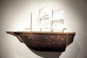
This week, I'd like to start with a visual exercise. Look closely at the two images below (MADE IN, to the left, and The Brookes Ship to the right).


The Brookes Ship, 1789


What similarities and differences do you notice? They're both images of boats, yes. One is a diagram, while another appears to be a photograph of a 3-dimensional object. One was created in 1789, the other 223 years later. Removed from their context, it might be a challenge to understand how these images relate (besides being boats), or what they represent. Interpreted within the context of Cash Crop, however, their powerful connection and important message becomes hauntingly clear.

Let's start with the diagram. While conducting image research for a printmaking class at the Savanna College of Art and Design (SCAD), artist Stephen Hayes came across an image diagramming the Brooks Ship, a boat that operated within the transatlantic slave trade from about 1781 to 1806. During its 25 year lifespan, the ship carried over 5000 Africans. This diagram of the ship was published in 1789 by a member of the Society for Effecting the Abolition of the Slave Trade in England. It depicts how the ship was designed to stowe 454 slaves, exactly the legal limit of slaves a ship of its size could transport. Prior to a law enacting this limit in 1788, the Brooks had crammed up to 609 slaves onto its lower decks at a time. You can learn more about the history of the ship, here.


Hayes' Brooks Diagram
The image and story of the Brooks ship stuck with Hayes, and it became a central motif for his MFA thesis at SCAD and the exhibition, Cash Crop was born.

Having already traveled to institutions in North Carolina and Georgia, the exhibit is currently on display at The African American Museum in Philadelphia. Put simply, Cash Crop examines how people and goods are imported and exported. Not only does the artist look at the Transatlantic slave trade, but also addresses the modern injustices of sweatshops and unfair labor. As the introductory text panels states (in an informal museum voice), the exhibit links “the millions who were transported in slave ships like cargo in years past and the millions today who are confined to factories, like extensions of machines.” Throughout the exhibit, interpretations of the Brooks Ship appear in cement casts, prints and drawings, and etched into a quilt panels made of fiber board.

The artist with his piece entitled, Gluttony

 Detail of wall of wooden boxes with cast cement ships

Now, let's return to the image of the 3-dimensional boat entitled MADE IN. In a few pieces, including this one, the artist steps away from the Brooks ship motif.  Instead of referencing a historical object, MADE IN highlights a more contemporary item that visitors will recognize. At first glance, you probably missed them, but The sails of the ship are composed of simple white labels, each printed with the name of a country. See now?

Detail of MADE IN's sails
Stitched into nearly every item of clothing, stamped onto the bottom of home goods, printed on consumer packaging, today, product labels are ubiquitous. Sure, they inform consumers where items were produced, but Hayes challenges viewers to consider ideas like, 'Who makes these tags, and the products they label?' and 'Is this ship, seemingly bloated with cargo, full of slaves or products made by the enslaved?' In some sense, here are a bunch of little flags waving in protest, waving to wake us up to the realities of present-day labor conditions. 

Still, the beautiful curve of the wooden ship, and the gracefulness of its sails can be disarming; at a distance, this object doesn't immediately evoke the realities of sweatshop labor. However, within the context of the exhibit, it is difficult to ignore the darker narrative this vessel, and its sails implies.


Close-up of figures
Hayes' life-sized figures
Nearby stand 15, startlingly realistic life-sized cement figures. Each is shackled by steel chains, and bound to a wooden shipping pallet that resembles a small boat or coffin. These statues symbolize the 15 million African people forced into the slave trade between 1540 and 1850. While these objects reference the past, the statues seem to represent modern day sweatshop workers, as well. For me, these figures deepened my ability to interpret MADE IN, for here, I saw the people behind the product tags.

Anyone with an interest in contemporary social justice issues such as race, gender, politics, economics, consumerism, poverty, and human trafficking may find MADE IN to be an important and provocative piece. Artistic-minded individuals may also appreciate it as a finely-crafted piece of woodworking.


Viewers strictly interested a historical narrative about the Transatlantic slave trade might not be interested in this MADE IN. Some individuals may not wish to discuss contemporary issues of human trafficking and labor conditions. Perhaps they do not wish to confront their connection to the problem, find the matter too distressing, or may simply be apathetic to issues that they feel are out of their control.

more info
An alternate view of this exhibit might argue that sweatshops are merely a reality of contemporary economics; it's just supplying the products that consumers demand. In this narrative, the laborers are stripped of their humanity in an effort to allow the consumer to maintain his or her innocence.

In order to better understand “Made In” it might be helpful to explore international labor laws, as well as the history of cash crops. One could learn more about human trafficking through CNN's The Freedom Project or through books like Human Trafficking Around the World: Hidden in Plain Sight, by investigative journalist Stephanie Hepburn. 

It would also be interesting to learn about the ways the Brooks (or Brookes, as it is spelled in the UK) Ship has been interpreted by other artists. The live recreation pictured in the photo below, which took place at the York Castle Museum. Pretty intense, right? Read more about it, and other related exhibits, here.
 Recreation at the York Castle Museum


Anti-Slavery Broadside
As text panel about the Brooks ship notes, the ship’s diagram was used in broadsides and posters throughout London, Philadelphia, and New York. The graphic of the ship was distributed on posters and broadsides in shocked and awakened the general public to the horrors of the slave trade. To further engage visitors with this object, I would create a workshop where visitors would learn more about the historical significance of broadsides, and then create their own posters of protest. After studying MADE IN and several samples of broadsides, visitors would find the tags on their clothing. Identifying the manufacturer and/or country where their personal items were made, they would conduct research about that company and/or the labor conditions of that country using online tools like http://www.free2work.org/. Their broadside would be based on these findings. 

I challenge you to do your own research--where and by whom are your clothes made? Are there people being harmed or exploited in one or more steps along the process? Are there changes you can and should make as a consumer to support a more just system of supply and demand? 


Tuesday, November 18, 2014

Crazy Nora

Title: Crazy Nora
Year: 1865
Material: Oil on canvas
Creator: William Winner
Collection: Historical Society of Pennsylvania, Gift of A. Cuthbert Thomas, 1897

Growing up in a small college town in Western Pennsylvania, I didn't see too many homeless folks on the streets. Except for Crazy Jake. No one (in my age group) knew if Jake was actually homeless (I don't think he was), but there was general consensus that he was a bit off his rocker. Jake mumbled to himself, as he walked the streets in tattered clothing, often pushing grocery cart full of aluminum cans and glass bottles and hauling various plastic bags. To many, Jake was scary, mysterious character. Lore surrounded him. 

During my first years in Philadelphia, I became involved in a few organizations that work with the homeless community. I led art activities on the weekends, served soup and coffee at an overnight cafe, and delivered weekly bread donations from a local bakery to a soup kitchen. I learned more than just people's faces and names; they shared their stories, and I shared mine. 

This week's object reminds me both of the local gossip surrounding  Crazy Jake as a child in my hometown (I sure I had many misconceptions), and the realities of homelessness that I've grown to better understand. I introduce to you, "Crazy Nora." 

This painting is one of 25 that are displayed in Face to Facebook, an exhibition at the Philadelphia History Museum showcasing portraits of Philadelphians from the 17th through 21st centuries. Most images depict well-dressed individuals of higher social standing or historical “significance,” including George Washington, Charles Wilson Peale, and Abolitionist Harriet Lee Smith. Yet, wrapped in layers of tattered clothing, accompanied by her well-worn belongings, here also hangs homeless Honora, the center of local gossip. 

Throughout the gallery, questions and statements about identity invite visitors to consider how notions of personal identity have changed over time and other ways they remain the same. For instance, social media has impacted
the way people share information and present themselves—often creating bifurcations between who one is “online” verses “offline.” At the same time, people have coupled their identity to their occupations ("I am what I do"), and their relationships ("I am so and so’s wife") for centuries. It is suggested that these portraits explore how individuals see themselves, as most were commissioned by the subject. However, as the text panel (presented in a narrative museum voice) states, “Crazy Nora” was not a commissioned work. I wonder if she even consented to this painting, and if she saw the finished product, felt it was an accurate portrayal. Unlike most other subjects, Nora’s significance (in the eyes of the painter, and seemingly much of society) is rooted in her assumed mental instability and subversive behavior.

The text panel suggests that Honora was driven mad through her involvement in a rebellion against the teachings of the Catholic Church in the 1820s. She joined a group led by William Hogan, a priest at St. Mary’s Catholic Church on 4th Street, who argued against celibacy, created a renegade church and was excommunicated. More than simply a genre painting of Philadelphia street life, an opposing point of view might argue that this painting is Honora’s “Scarlet Letter.” She resisted the church, was besieged by her sin to the point of insanity, and was driven to a life on the street.

This object could be important to individuals interested in local history and lore, and genre paintings of Philadelphia street life. It would also appeal to those interested in the work of William Winner in particular, and portraiture more generally. Mental health advocates and those concerned with issues of poverty and homelessness may also view this painting as significant. 

One’s understanding of this object could be enriched by studying any of these topics. To delve more deeply into the history of Philadelphia streets and neighborhoods, check out PhilaPlace 
The Pie Man 1856
One could also explore (and support!) two amazing organizations that provide an array of services to Philadelphians in need of homes, employment, and health services: Project H.O.M.E. and The BethesdaProject

I took a look at some of Winner’s other paintings. While they also focus on a figure in the foreground, notice how these other streetscapes include a lot of background activity. Compare this to Nora, who stands in solitude. Perhaps Winner is intentionally alluding to her social ostracization?
Newsboy 1864


Individuals who are merely interested in portraits of Philadelphia’s literal and figurative "bigwigs" may not be interested in this object. It might also strike an unwelcome chord to those who have strong feelings (personal, religious or political) about homelessness, mental illness and religious dissidence. 

info
The accompanying text panel concludes with the question, “Do you think people should always have a say in how they are pictured?” This is a good way to start a conversation about privacy and censorship that easily relates back to modern day applications. However, I would wish to take the discussion in a slightly different direction and focus on the issue of homelessness. Recall, this painting was created ONE HUNDRED AND FIFTY YEARS AGO. As scholar Kenneth Kusmer writes in Down and Out on the Road: The homeless in American History, homelessness originates back to colonial America. There are many misconceptions about how and why people become homeless, and what can and should be done to address this social inequality. 

Knowing that the Philadelphia History Museum has found more success in weekday evening programs, I would plan a program in partnership with the aforementioned local organizations, Project H.O.M.E. and The Bethesda Project. In conjunction with these organizations, members of the homeless (and formerly homeless) community would be invited to create self-portraits in various artistic mediums, which would then be displayed at PHM. At the opening reception, one of my heroes (and founder of Project H.O.M.E.), Sister Mary Scullion, would speak, as well as a few of the participating artists. It’d be interesting to see how the images created compare to William Winner’s depiction of Honora Powers. By the way, isn’t that an incredible name? Honora Powers? Honor and Power—in some sense, that is exactly what individuals like Honora need and deserve—honor, or respect, and power, or resources. In the words of Sister Mary, “None of us are home until all of us are home.”


Tuesday, November 11, 2014

Happy Accidents

Title: 14 karat Gold-Plated Commemorative Slinky
Year: 1990s
Material: 14 karat Gold-Plated metal coil
Creator: Poof Slinky Company
Collection: Please Touch Museum

Who walks the stair without a care
It shoots so high in the sky.
Bounce up and down just like a clown. 
Everyone knows its Slinky.

The best present yet to give or get
The kids will all want to try.
The hit of the day when you're ready to play
Everyone knows it's Slinky.

It's Slinky, It’s Slinky
for fun it's the best of the toys
It's Slinky, It’s Slinky
the favorite of girls and boys.


Remember that jingle? If not, this 1960s commercial, or the 1980s version, which I remember, will bring you up to speed. As a popular toy of the later half of the 20th century, it only seems right that the Slinky is displayed at the Please Touch Museum (PTM), a museum of play. What's more, it was invented here in Philadelphia, is Pennsylvania's official state toy, and is included on the Toy Industry Association's "Century of Toys List." The Slinky is a celebration of the simplicities of childhood, Philadelphia innovation, and happy accidents. 

1960s Slinky Science
It all started in Philadelphia in 1942, when naval engineer Richard James, busy at work on a mechanical spring project, knocked something from his desk; a discarded coil of spring wire. As the coil fell, it bounced horizontally across the room. Inspired by its movements, James experimented with the steel and tension, and invited his young son to play with his prototypes. When the Slinky hit the shelves of Gimbels Department Store in 1945, 400 Slinkys sold within the first 90 minutes.

Today Slinky is produced by the Poof-Slinky company in Hollidaysburg, PA close to where I grew up. In addition to the original toy, a Slinky Dog and Slinky Train, were later developed. Most recently, the Slinky Dog was redesigned as a character in Toy Story and for today’s youth, this may be their primary Slinky-related point of reference.


This 14 kerat gold plated coil of metal is displayed in a glass case, along with several other plastic and metal versions of the toy, in multiple sizes and colors. To create visual interest, some toys are placed on top of their original packaging, some are slinking out of their boxes, and others stand arched, appearing to be in mid-slink. Presented in a museum voice, a small text label inside the case briefly describes the toy’s history. I can’t help but mention that I found a grammatical error on the text panel (unhappy accident). Besides a sitting area that is made to resemble a train station, the case stands apart from other objects or play areas. It is near the entrance to the World’s Fair Centennial Exhibit, which out of all PTM’s exhibits, caters most to an adult audience. I assume that this placement was intentional, as adults probably best relate to the Slinky.


This object may be important to visitors who have fond memories of playing with the toy, or singing along with its catchy  jingle on television commercials. It may also appeal to individuals interested in toy history and design, anyone with knowledge or curiosity about Physics, fans of Toy Story, and appreciators of simple, affordable toys.
In order to learn more about this object, one could explore the Physics
behind its movements. It might also be fun to relive my childhood through toy history books, such as Toy Time!: From Hula Hoops to He-Man to Hungry Hungry Hippos: A Look Back at the Most-Beloved Toys of Decades Past by Christopher Byrne. It might also be fun to explore other inventions that were made by mistake,  as well as this article about the accidental improvements that were made to another toy in the 1990s.

Unfortunately, I doubt that many children living in 2014 would have any long-lasting interest in this object. Sure, the first few trips down the stairs may rouse some giggles, but where are its screens and buttons and sounds? Children may be more interested in watching an onscreen Toy Story version than having the actual toy in their hands. From a modern day child’s point of view, the Slinky may be a toy of the past; maybe something that entertained grandma and grandpa, but they’re reeeaaaalllly old and aren't in touch with what the kids want these days.

Currently, all of the Slinkys on display at PTM are motionless and out of reach. In order to engage viewers with this object, I would provide versions that are accessible for hands-on play. There seems to be a fair amount of open space in the Train Station corridor, where the display case currently resides. I would create a miniature staircase where with the assistance of the museum’s Experience Hosts, visitors could test Slinkys. I might also have a viewing station where visitors could watch the original Slinky commercial, which might be particularly fun for older adults who may have fond memories of playing with the toy.

To incorporate some scientific principles for older kids and adults, I might create a basic take home guide that explores how the toy demonstrates rules of Physics. The guide would instruct users to perform “experiments” with their Slinky at home, and introduce how Newton’s law of gravity and centripetal force come into play. Assuming that PTM sells the toy in their gift shop, this might be a good money-making opportunity. 

Here's another great thing about this object; the first Slinkys were sold for $1 and most still range between $2 and $20. Simplicity and affordability, are in my opinion, characteristics you'd want in any toy...top that off with a catchy jingle, and you're golden. 

Tuesday, November 4, 2014

From Jenny Lind to Lady Gaga

Title: Jenny Lind
Year: Circa 1850
Material: Cast Lead
Creator: Unknown
Collection: American Swedish Historical Museum


Today, popular music is a big business. Artists make records, they go on tour, perform on television, promote their albums through interviews and printed reviews. Granted, things are changing in our digital age, but there is still a pop music industrial complex. It happens on multiple levels: the industry uses its stars to sell amorphous things, like an ideology or a lifestyle, but they also look to sell tangible items: albums, concert tickets, and merchandise.

To be sure, I’m a consumer of the later. As a teenager, the concert-going experience wasn't complete until I had a new Radiohead t-shirt or Ani DiFranco signed poster in my hands.  I guess I've thought this was a relatively recent phenomenon. Sure, I knew about the crazes around the Beatles and Elvis, but as I realized during this week’s visit to the American Swedish Historical Museum (ASHM), the culture of musical celebrity has a much longer history. Long before Beatlemania, there was Lindmania.  

ASHM’s Jenny Lind Room is dedicated to one of the most renowned vocalists of the 19th century. By the age of ten, Lind was performing in operas across Europe and developed a reputation as the “Swedish Nightingale.”  Her popularity exploded when she completed a 93-stop American tour, managed by showman P.T. Barnum. Public enthusiasm was so strong that the American press coined the term "Lind mania". An early philanthropist, Lind donated her concert earnings, over $350,000, to American and Swedish charities.
The gallery contains objects that both belonged to Lind or represent her talent, as well as items from the Jenny Lind brand of merchandise. One item that caught my attention was a 10 inch tall cast lead sculpture of Lind. Unlike the colorfully painted porcelain statues and bright artistic portrayals of the singer throughout the space, this one was heavy and dark.

The statue was given to the museum by Lennea Farr in 1947. While no specifics are provided, Lennea is listed among many contributors noted by the “Reports of the Curator” section of the American Swedish Historical Museum: Yearbook 1947. I found this 120-page document online. If you’re curious, you can find it here. This object is displayed in a square glass case, alongside several other Lind artifacts, including a cigar box, a wooden hand-held fan, glass bottles, sunglasses, and two additional statues. Large marble busts of Lind and her husband, once owned by the couple, also stand on pedestals nearby. In an informal museum voice, the object label notes that “statues that like one were cast around of the time of Jenny Lind’s tour of America and sold as souvenirs.”

Lind's left hand cast in bronze

MJ and Bubbles by Jeff Koons
Another case displays the Jenny Lind Girandole Set, a collection of 19th century dishes and serving ware. This is also where I found the most surprising Lind-related object: a bronze cast of Jenny Lind’s left hand. Immediately I thought of Michael Jackson’s white gloves,and the life-sized sculpture by Jeff Koons. Still, in some way, this hand, its material, and the fact that its a severed body part, feels a bit more peculiar. I wasn't able to find much information about the hand, so I don’t know if it was also mass produced like the statue. Let’s say that it was a concert merch item, for a moment. After shaking the hand of a celebrity, I've heard people say “I’ll never wash my hand again,” but this takes it to another level. It actually invites a fan to take home their pop idol’s hand. And assumedly hold it. Forever. Borderline stalker-ish, if you ask me. If any modern icon had something like this, it'd be Lady Gaga.

At any rate, the lead statue, and other objects on display provide some insight into Lind’s life and aesthetic tastes, and allude to her distinctive cultural contribution as a Swedish vocalist, as well as her wide-spread celebrity.  This object is important to anyone interested in Swedish heritage, music history, lead sculpture, and the evolution of popular culture.


To better understand the significance of this object, one could start by reading more about Jenny Lind and exploring images of her other merchandise online, like the doll kit pictured here. She appears to have established quite a brand. It might also be helpful to listen to and read about the music of Sweden, both today, and during Lind’s glory days. There are also some interesting books about the culture of celebrity and "mania." Constructing Charisma: Celebrity, Fame, and Power in Nineteenth-Century Europe by Edward Berenson might be a place to start. What’s more, can watch, The Lady Gagas of the 19th Century, an hour-long lecture by University of Chicago historian Amy Lippert, here.

Individuals with a staunch opposition to celebrity culture, or “worldly” possessions may not be interested in this object, but it is unlikely that these types of folks visit museums very often, if ever. Generally, I feel that this object represents ideas that are relatable to almost anyone. Even young children understand the idea of fame—through superheroes, Disney Princesses, and Elmo.

An opposing point of view might argue the this object, and the exhibition, doesn’t do Jenny Lind justice. It doesn’t answer questions like ‘What did Jenny Lind’s voice sound like?’ and ‘What other types of music were popular in 19th century Sweden?’ Although ASHM has obtained an extensive sheet music collection, “due to the fragility of paper artifacts,” wall text notes, “much of the collection can only be exhibited for short periods of time,” and none is currently on display. Preserving this delicate collection may be important, however the museum could display reproductions of sheet music that would complement the Lind artifacts and offer deeper insight into Sweden’s musical heritage.

Moreover, to encourage more visitor engagement, the museum could consider including additional cultural artifacts that would enhance the Lind objects. For instance, despite the fact that there may not be any audio recordings of Lind, I would expect there are later recordings of other Swedish operatic performances, as well as other genres of Swedish music that ASHM could acquire and integrate into the gallery. Adding a music listening station to the exhibit would provide an interactive component, which is noticeably lacking in the gallery, and may help deepen a visitor’s understanding of the collection, who it commemorates, and how it relates to a larger Swedish narrative. Likewise, the objects in the room do nothing to illuminate Lind’s passion for helping others. ‘What causes did Lind financially support?’ ‘How did these charities employ the funds?’ ‘Did Lind develop personal relationships with these groups?’ If this room is truly to honor Jenny Lind, it might be useful to also present objects and ideas that explore her musical and philanthropic life.

These days, it’s usually big news (and good press) when pop idols contribute to or serve as ambassadors for charitable causes. Check out this list of last year’s 25 most charitable celebrities, including Elton John, Paul McCartney, Bono and Madonna. Meanwhile, I’ll keep scouring the internet for bronze casts of Lady Gaga’s left hand. None have turned up yet, but I did find this.